About the Dashboard
The dashboard is the central hub for your campaigns, ad groups, and ads. It's the first thing you see when you log in, and you can use the graph and table to view the data that matters most.
Do you learn better by watching? Watch the next video or check out other tutorials on the Ads Formula.
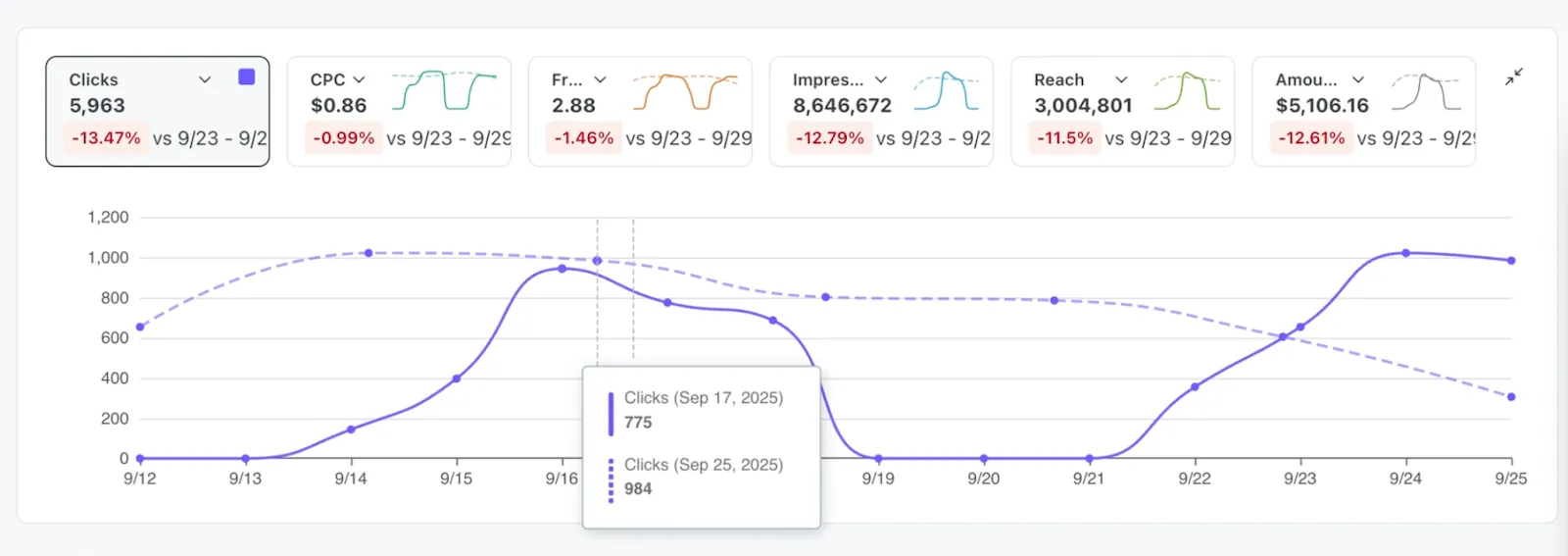
Customizable graph
The graph lets you view your performance metrics over time, with quick access to popular metrics. With this graph, you can:
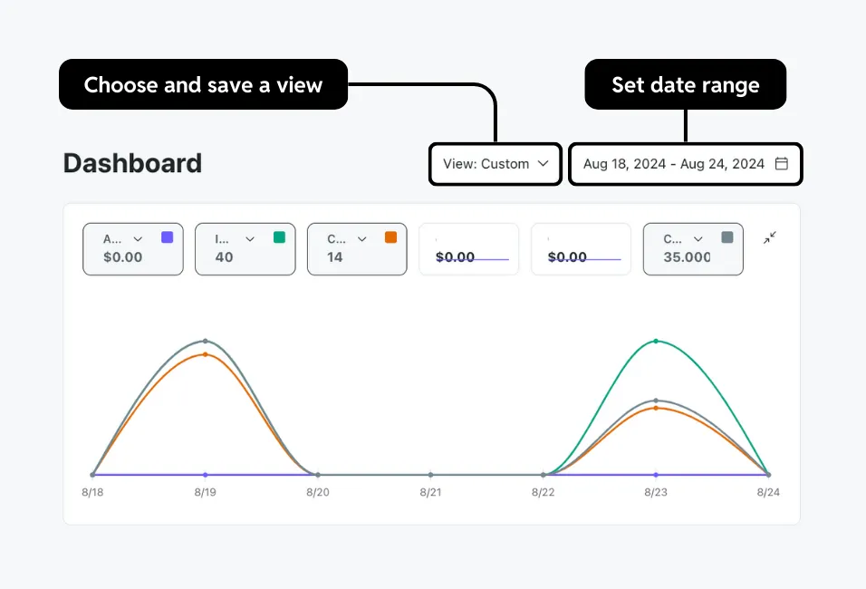
- Choose and save a view: Filter data by details like statuses, IDs, or campaign objectives. You can also save your view by selecting View: Custom > Save current view.
- Set date range: Change the time range for the metrics you want to capture. You can also choose to compare two date ranges.
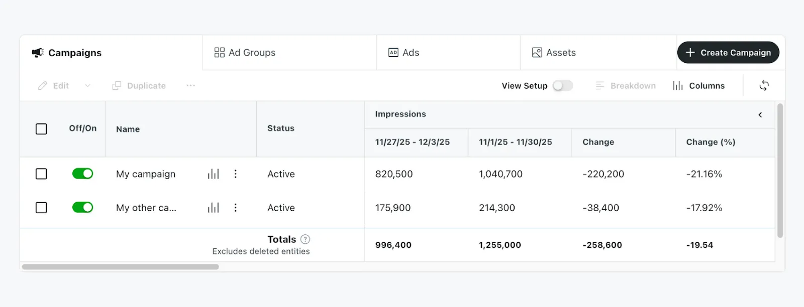
Customizable table
The table displays metrics for campaigns, ad groups, and ads. With this table, you can:
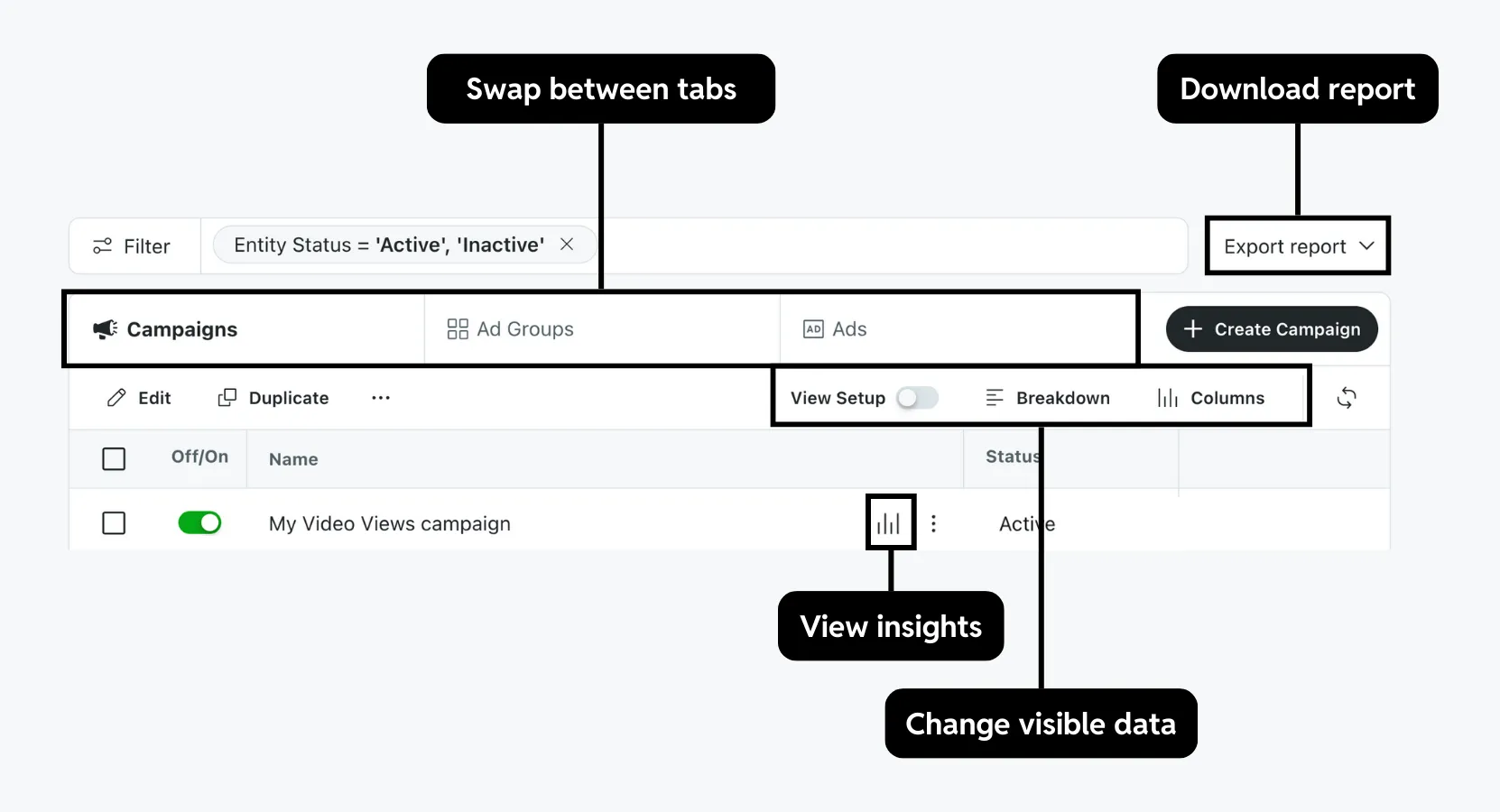
- Swap between tabs: View metrics for campaigns, ad groups, ads, or assets.
We don’t recommend turning off poor-performing assets in Max campaigns or ads in non-Max campaigns.
- Change visible data:
- View setup: Toggle on to see a summary of your entity settings only.
- Break down your metrics: Sort by dimensions like date, location, or placement for a detailed view. Up to 100 rows can be shown. Selecting a community, keyword, or interest will start a report export.
- Adjust columns: Add, remove, or reorder table fields. Learn more about customizing your table.
- View insights: See who your campaigns reached. For max campaigns, see which asset combinations performed best.
- Download a report: Download your current dashboard view as a CSV file or create a report. You can customize your export or schedule a report in the Report Center.
Customize your table
You can change the table by opening Columns and selecting any of these options:
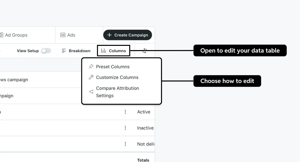
- Preset columns: View metrics based on campaign objectives or use a saved custom preset.
- Customize columns: Choose the columns to show on the dashboard.
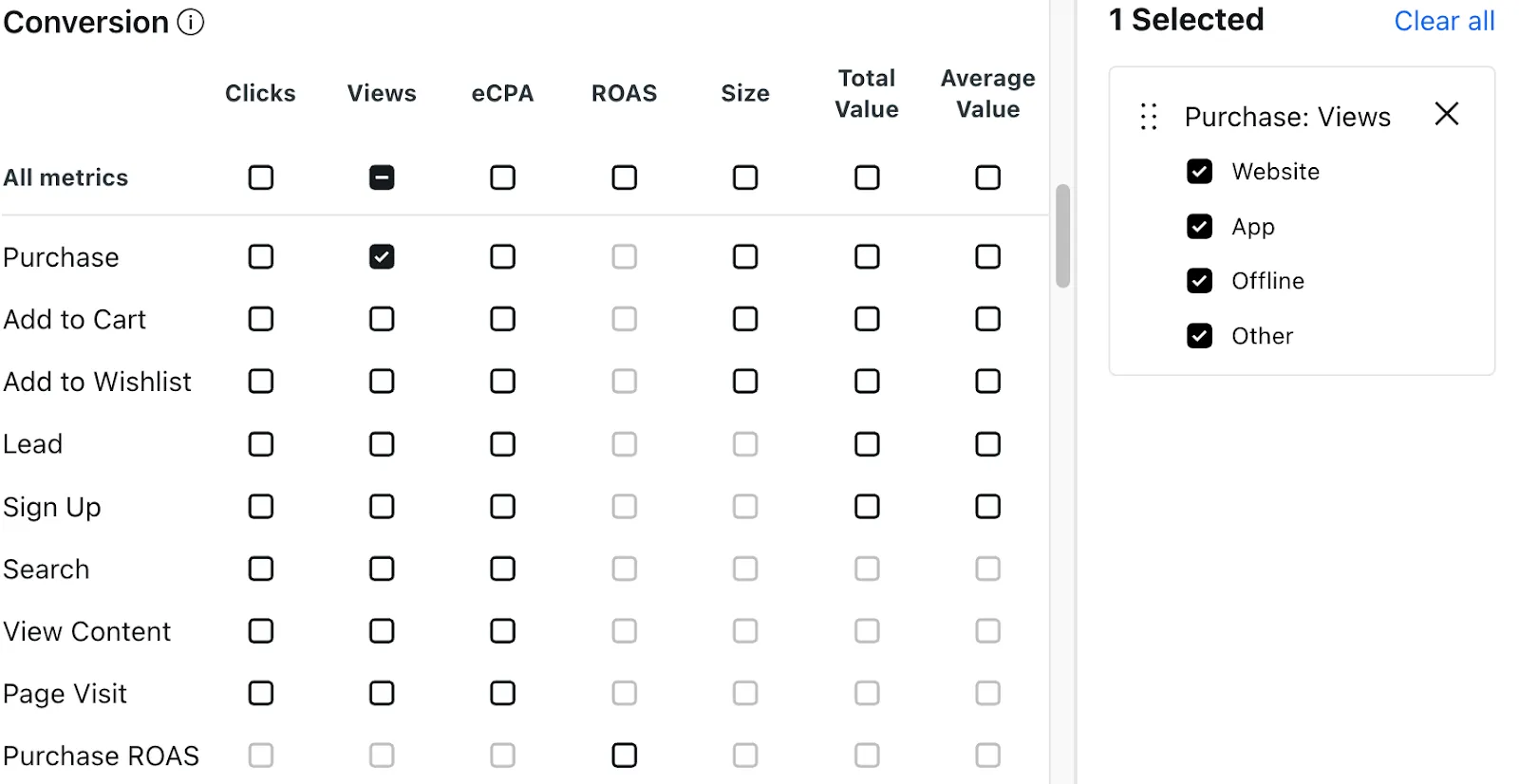
- Compare attribution settings: Compare conversion metrics across different attribution windows, like 1-day to 7-day clicks.
Your current table must have at least one conversion metric visible, which you can set up with preset or custom columns.
Choose a preset
- Select Columns > Preset Columns in the dashboard.
- Choose a preset based on your campaign objective: recommended presets for relevant metrics, saved presets for your customized views, or presets by objective for default options based on campaign goals.
- Select Submit to apply the changes.
Customize columns
- Select Columns > Customize columns in the dashboard.
- Check boxes for metrics to display and drag to reorder.
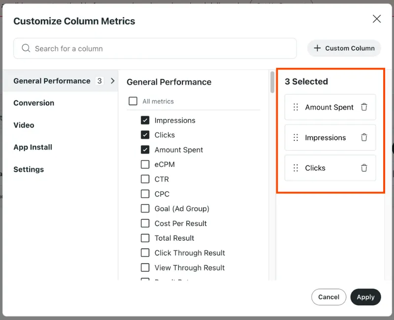
- Apply to save changes.
Save your changes as a custom preset to reuse later.
View audience insights
We don’t recommend narrowing your audience based on these insights. Campaigns already consider a wide range of factors to reduce delivery to people unlikely to convert.
- Select the Campaign or Ad Groups tab.
- Select View insights by the entity’s name.
- Review the audience and creative combination data.
- Audience: See the top interest and communities your reached redditors share.
- Top combinations: View which creative asset combinations performed best.
Save a custom preset
- Select Columns > Preset columns in the dashboard.
- Choose Saved Presets > Create a New Preset.
- (Optional) Choose any additional columns to add.
- Select Save preset.
- Give your preset a name and select Save & Apply to make changes.
Column categories
General performance
Summary of the metrics captured by Reddit Ads.
Examples:
- Impressions
- Clicks
- Amount spent
- eCPM (effective cost per mille)
- CTR (clickthrough rate)
- CPC (cost per click)
- Pacing
Conversions
Learn more about event metadata reporting metrics.
Data captured by the Conversions API and Reddit Pixel. This can be further broken down by action source.
Examples:
- Clicks
- Views
- Engaged click
- eCPA (effective cost per action)
- Total value
- Average value
- Cart size
- ROAS (Return on ad spend)
Video
App install
Metrics for mobile conversions reported by mobile measurement partners (MMPs) or SKAdNetwork.
Examples:
- App installs
- eCPI (Effective cost per install)
- eCPA
- eCVR (effective conversion rate)
- ROAS
Settings
Information on how your campaign assets are configured.
Examples:
- Campaign ID
- Objective
- Bid type
- Custom audiences
- Click URL
Custom columns
Any unique metrics that you created with custom columns. See example use cases.
Compare performance across date ranges
Use comparison mode to understand performance changes over time. Open the date range selector and turn on compare to. A secondary range will appear automatically.
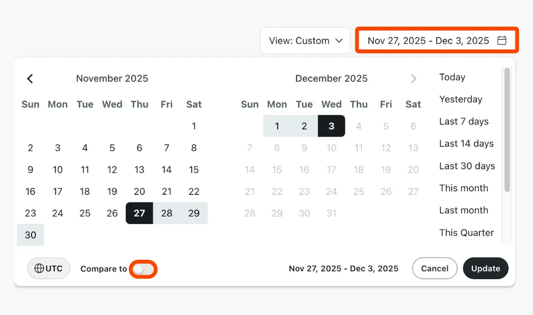
In the graph, the primary range will appear as a solid line, while the secondary range will be a dotted line. If the ranges are different lengths, the shorter one will be proportionally stretched across the longer one so each point aligns for a direct 1:1 comparison.
For the table, values will be shown side-by-side for each range. When supported, a percent change will also be displayed. All preset dashboard metrics are supported.
Breakdowns, CSV exports, and custom formulas aren’t supported in comparison mode. If the breakdown option is unavailable (greyed out), check that this mode is turned off.